
Launching a lifestyle brand that was made to be noticed.
Caisa Studio Creative Concept
Client: Rude Olive
Grab-and-Go Olive Snack Brand
Brief.
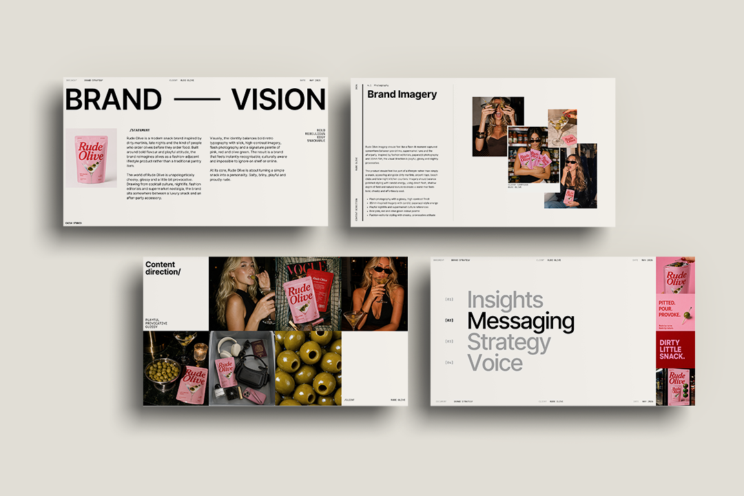
Rude Olive is a grab-and-go olive snack brand with a simple and brilliant idea at its centre. Take something people already love — the dirty martini olive — and make it portable, rebellious and impossible to ignore. The brief was to build the brand from the ground up. Identity, packaging and campaign direction that would make Rude Olive feel less like a food product and more like a cultural statement. A brand that didn't just sit on a shelf but demanded to be picked up, photographed and talked about.
Approach.
The starting point was the name. Rude Olive is not trying to be premium. It is not trying to be artisanal. It is trying to be the snack you grab on the way to a good evening with no apology. That attitude had to run through every decision, from the colour of the pouch to the copy on the back.
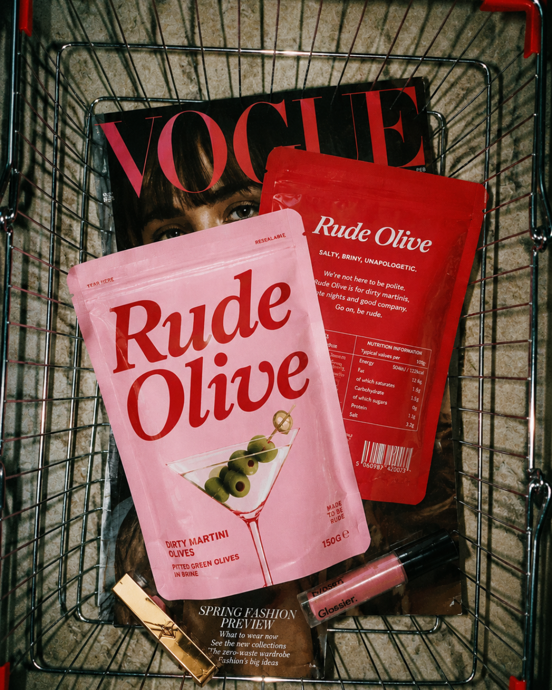
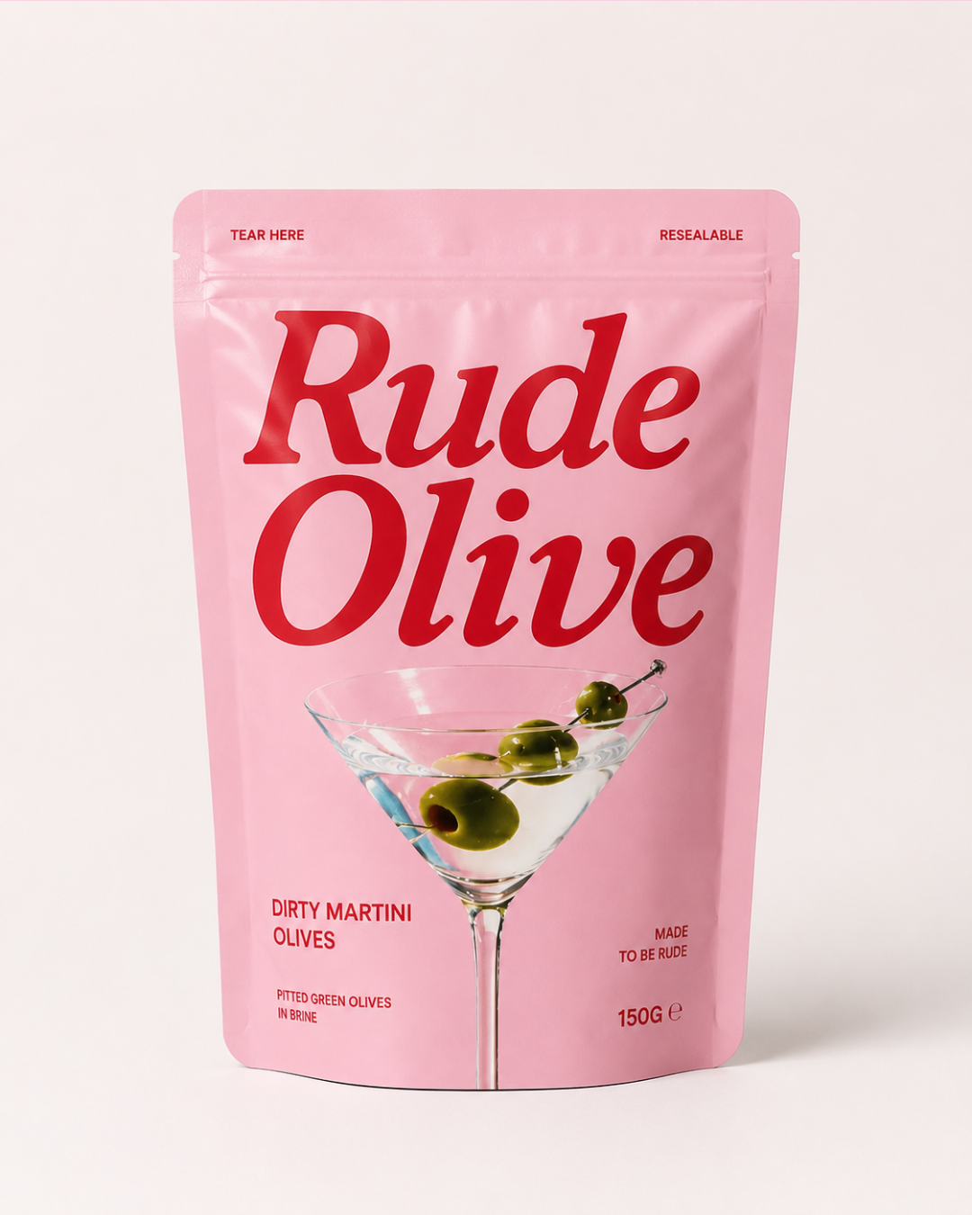
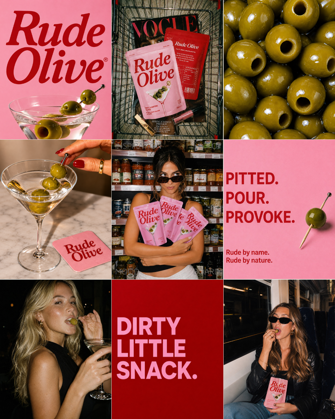
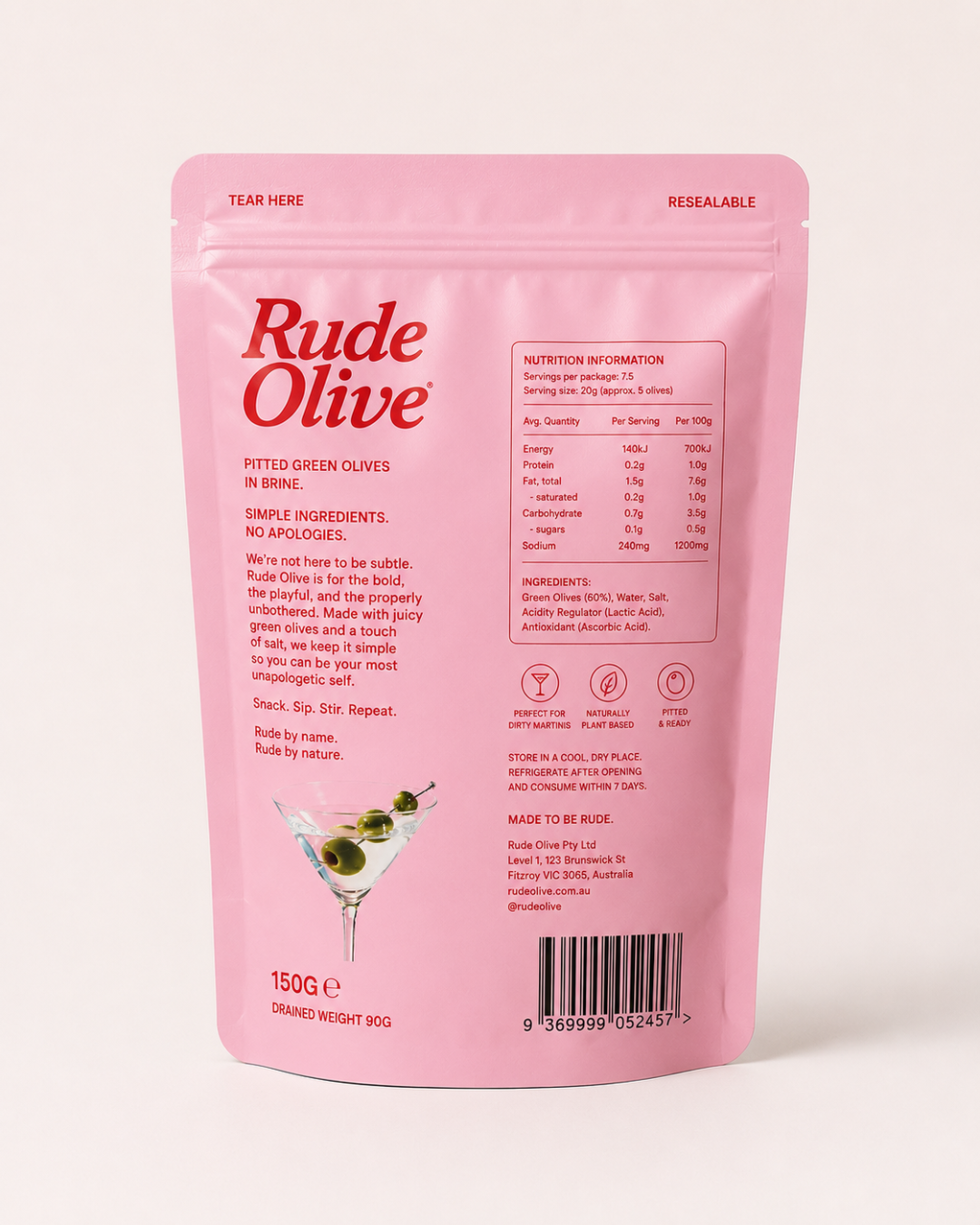
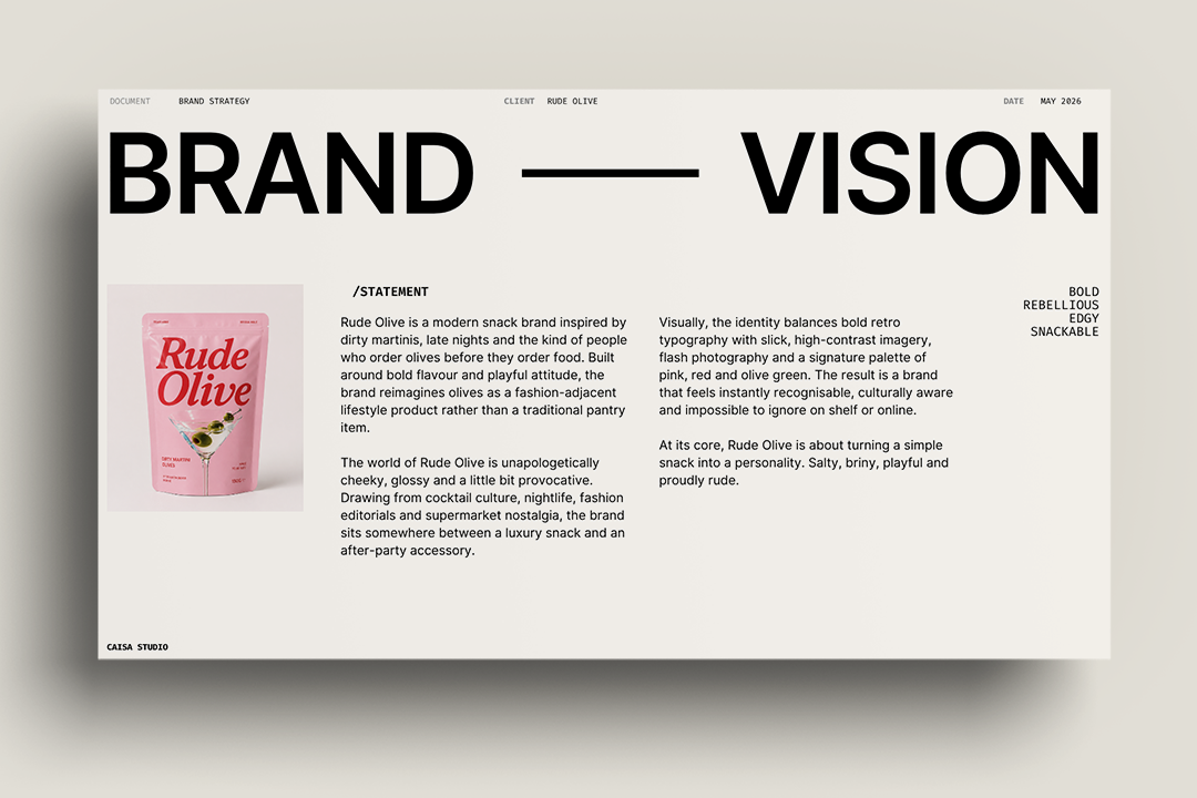
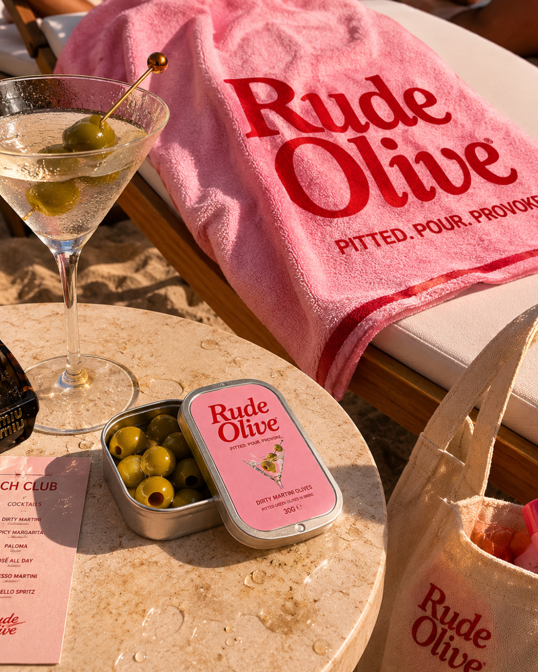
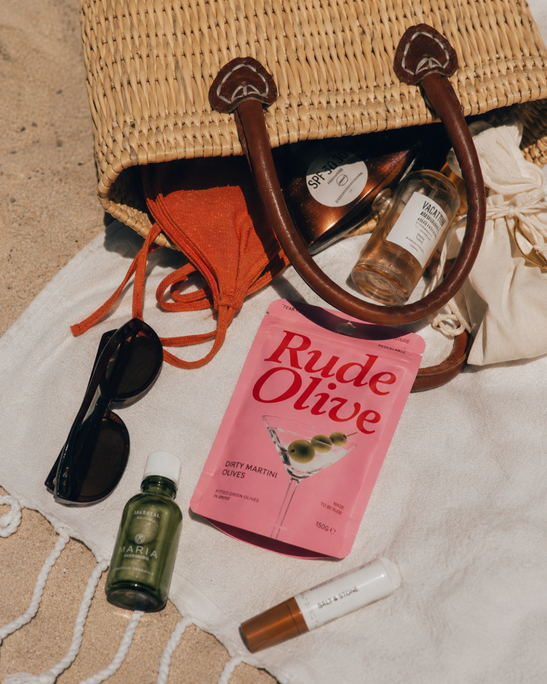
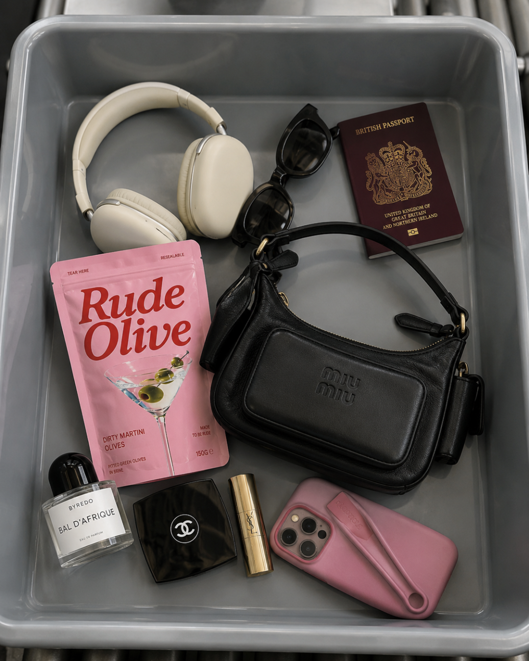
The visual identity was built around bold, unapologetic contrast. Hot pink and deep red. An oversized serif wordmark that takes up space. A dirty martini glass as the product's signature image, referencing the flavour while connecting the brand to the world of late nights and good company it was designed to inhabit. The result was packaging that didn't look like food. It looked like a brand.
The copy was given as much attention as the visual language. "Made to be Rude." "Salty, briny, unapologetic." "We're not here to be polite." Every word on the pack reinforces the same idea — this brand has attitude and it owns it without winking too hard.
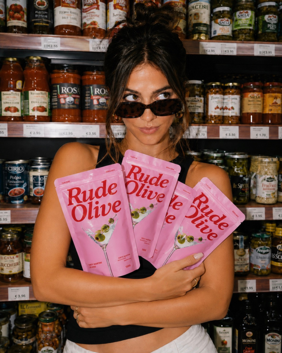
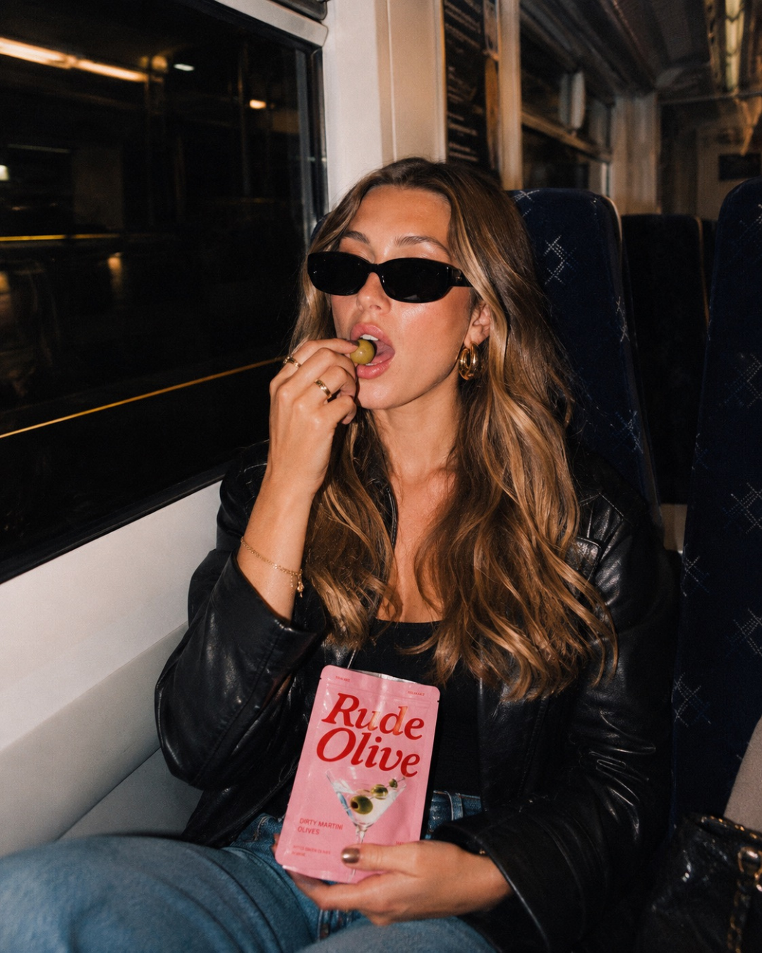
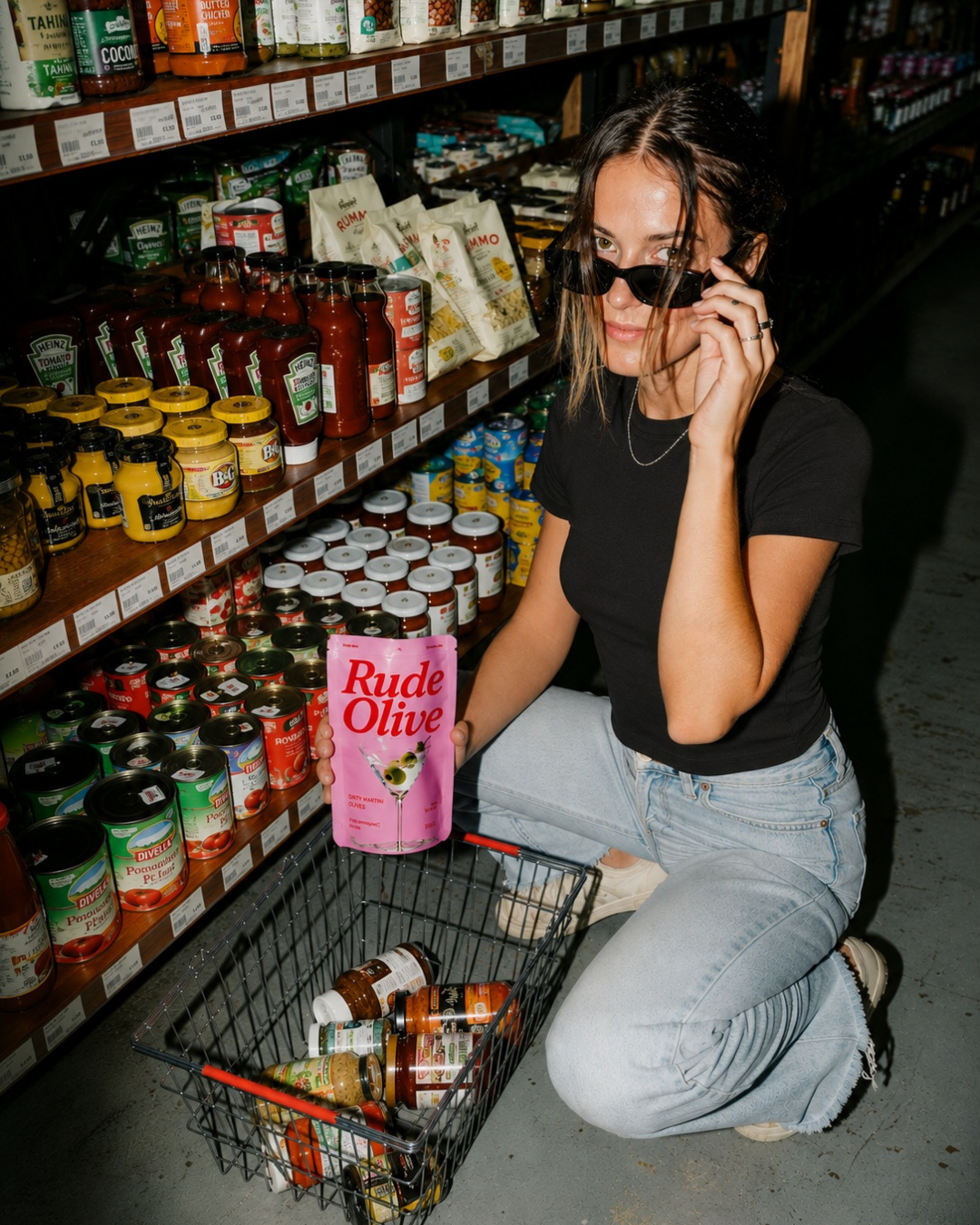
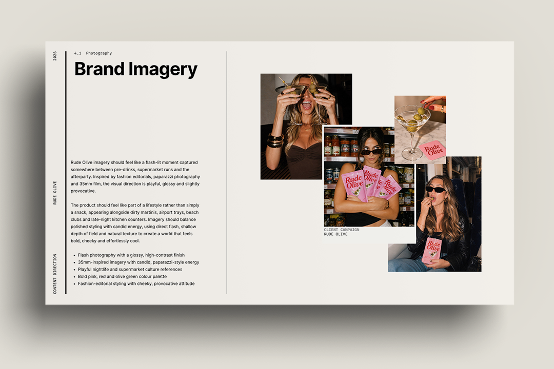
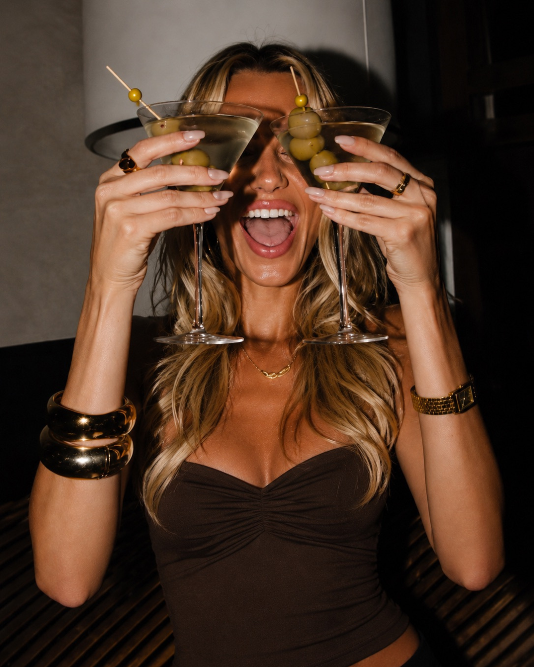
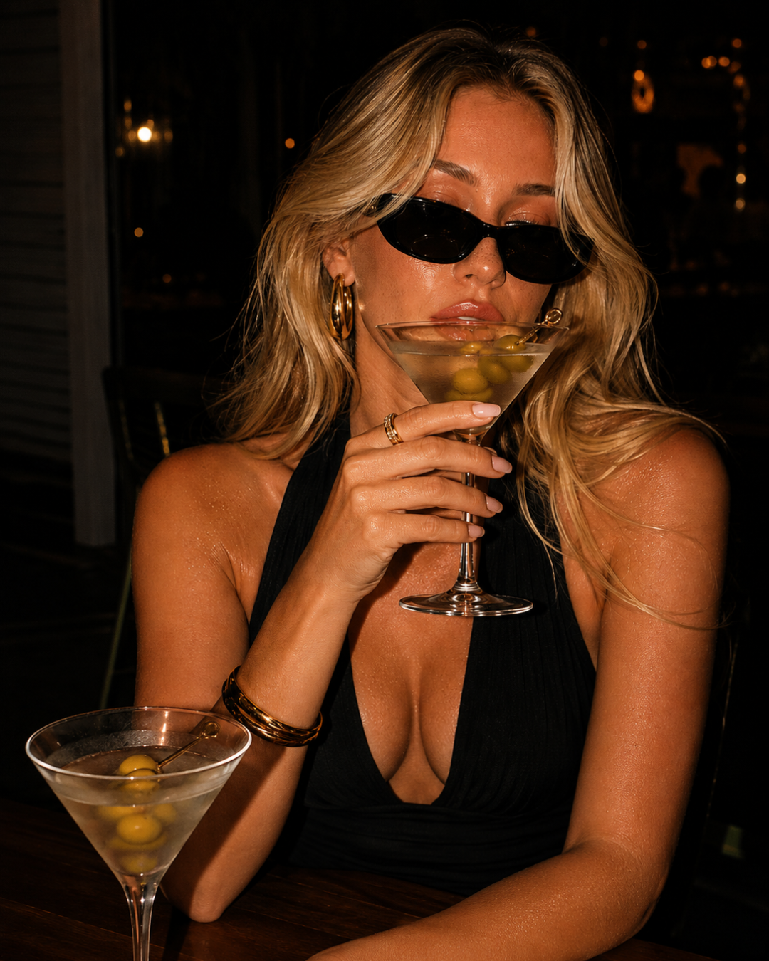
Campaign direction took the brand off the shelf and into the world. Rather than traditional food photography the creative placed Rude Olive in the environments where the audience actually lives. Supermarket aisles, train journeys, beach clubs, late night bars. Real people, real moments, real irreverence. The casting and styling… sunglasses, red nails, gold jewellery… amplified the brand's personality without explaining it. Creator content was designed to feel like it belonged to the same world rather than a separate marketing exercise.
Scope.
Brand positioning, messaging and naming concept — Packaging design - Visual identity direction — Social content direction and sample templates — Campaign creative direction.
Impact.
A brand that launched with a complete and coherent identity from day one — packaging, visual language, tone of voice and campaign direction all working together as one thing. Rude Olive does not look like a new brand trying to find its voice. It looks like a brand that arrived fully formed and entirely sure of itself.
The creative direction positions Rude Olive to be discovered the way the best modern brands are discovered — not through advertising but through culture. Content that gets shared because it is genuinely interesting. Packaging that gets photographed because it is genuinely beautiful. A brand world that attracts the right people because it knows exactly who it is for.
Interested in working together?
I work with founder-led hospitality and lifestyle brands shaping the next stage of how they grow, communicate and connect with people.
If you think we might be a good fit, I’d love to hear more about what you’re building.